Data Source:
EDA 연습을 위한 첫 번째 데이터셋은 Makeover Monday 웹사이트의 23년 넷째주 데이터셋인 'National Highway Traffic Safety Administration Automobile Recalls'이다. 미국의 자동차 리콜에 대한 데이터셋이고, 1966년부터의 리콜 정보를 담고 있다. 데이터셋에 대한 구체적인 정보는 아래의 링크를 통해 확인해볼 수 있다.
National Highway Traffic Safety Administration : https://datahub.transportation.gov/Automobiles/Recalls-Data/6axg-epim
작업환경은 무료로 구글의 클라우드를 사용할 수 있으면서 데이터 분석에 용이한 Google Colab을 이용하였다. Google Colab은 구글 드라이브에서 누구나 쉽게 이용할 수 있다.
https://colab.research.google.com/?hl=ko
Google Colaboratory
colab.research.google.com
- 구글 코랩에 연결하기
from google.colab import drive
drive.mount('/content/drive')
- 기본적인 데이터 처리 및 시각화 라이브러리와 데이터를 로드
import numpy as np
import matplotlib.pyplot as plt
import seaborn as sns
import pandas as pd
df = pd.read_csv('https://query.data.world/s/h4cgvavgdnxywxbbjnnlztdahzzidg')
이후 간단히 데이터를 살펴보았다.
df.shape
=> (26592, 12)
df.columns
=> Index(['Report Received Date', 'NHTSA ID', 'Recall Link', 'Manufacturer',
'Subject', 'Component', 'Mfr Campaign Number', 'Recall Type',
'Potentially Affected', 'Recall Description', 'Consequence Summary',
'Corrective Action'],
dtype='object')df.info()
=> <class 'pandas.core.frame.DataFrame'>
RangeIndex: 26592 entries, 0 to 26591
Data columns (total 12 columns):
# Column Non-Null Count Dtype
--- ------ -------------- -----
0 Report Received Date 26592 non-null object
1 NHTSA ID 26592 non-null object
2 Recall Link 26592 non-null object
3 Manufacturer 26592 non-null object
4 Subject 26592 non-null object
5 Component 26592 non-null object
6 Mfr Campaign Number 26563 non-null object
7 Recall Type 26592 non-null object
8 Potentially Affected 26550 non-null object
9 Recall Description 24191 non-null object
10 Consequence Summary 21704 non-null object
11 Corrective Action 24204 non-null object
dtypes: object(12)
memory usage: 2.4+ MBdf.head()df.describe()
- 결측치 확인하기
df.isnull().sum()
=>
Report Received Date       0
NHTSA ID                   0
Recall Link                0
Manufacturer               0
Subject                    0
Component                  0
Mfr Campaign Number       29
Recall Type                0
Potentially Affected      42
Recall Description      2401
Consequence Summary     4888
Corrective Action       2388
dtype: int64
plt.figure(figsize=(12,8))
df.isnull().sum().plot(kind='barh')
plt.title('Null Values', fontsize=18)
plt.savefig('null_count.png')
리콜에 대한 상세설명과 사후 처리 및 결과에 대한 결측치가 많은 것을 확인할 수 있다. 결과 요약은 거의 20% 가량이 결측치일만큼 결측치가 많다.
df = df.rename(columns={'Recall Link':'Recall Original Link'})
df.columns
recall_link = df['Recall Original Link'].str.split('(', expand=True).iloc[:,1]
df['Recall Link'] = recall_link.str.split(')', expand=True).iloc[:,0]
df.head()
위의 코드는 Recall Link라는 새로운 컬럼을 만들어서 주소만 분리해준 것이다.
ex) Go to Recall (https://www.nhtsa.gov/recalls?nhtsaId=23V002000) -> https://www.nhtsa.gov/recalls?nhtsaId=23V002000
(결과적으로는 의미가 없었다.)
- Top 12개 제조사들의 리콜 횟수 시각화하기
top_12_manufacturer = df['Manufacturer'].value_counts()[:12]

plt.figure(figsize=(12,8))
top_12_manufacturer.plot(kind='barh')
plt.title('Top 12 Manufacturer', fontsize=18)
plt.show()

plt.savefig('top_12_manufacturer.png')
General Motors, LLC, Ford Motor Company, Chrysler (FCA US, LLC) 3개의 회사가 유독 리콜 횟수가 많은 것을 확인할 수 있다.
- 리콜 타입 시각화하기
plt.figure(figsize=(12,8))
sns.countplot(x = df['Recall Type'])
plt.title('Recall Type', fontsize=18)

plt.savefig('Recall_Type.png')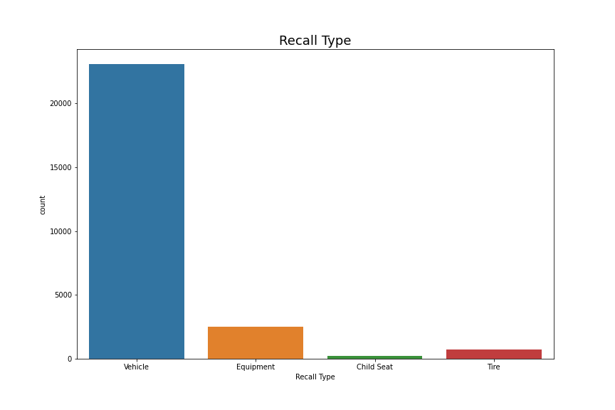
자동차 자체에 대한 리콜이 압도적이다.
- 리콜 횟수 Top 20개 리콜 부품 살펴보기
plt.figure(figsize=(16,10))
plt.barh(y = df['Component'].value_counts()[:20].index, width = df['Component'].value_counts()[:20])
plt.title('Top 20 Most Frequent Recall Components', fontsize=18)

plt.savefig('Top_20_Most_Frequent_Recall_Components.png')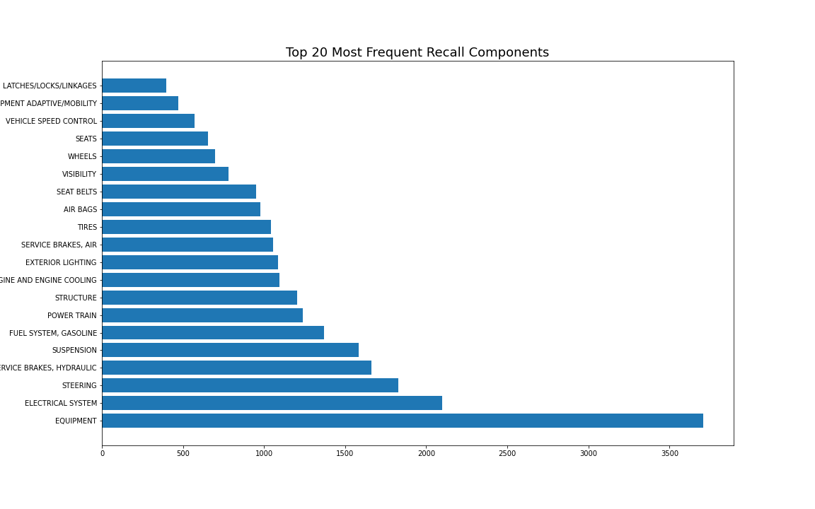
- 리콜 차량 Top 20개 리콜 부품 살펴보기
top_20_components = component_sum.sort_values('Potentially Affected', ascending=False)[:20]

plt.figure(figsize=(16,10))
plt.barh(y = top_20_components['Component'], width = top_20_components['Potentially Affected'])
plt.title('Top 20 Components', fontsize=18)

plt.savefig('Top_20_Components.png')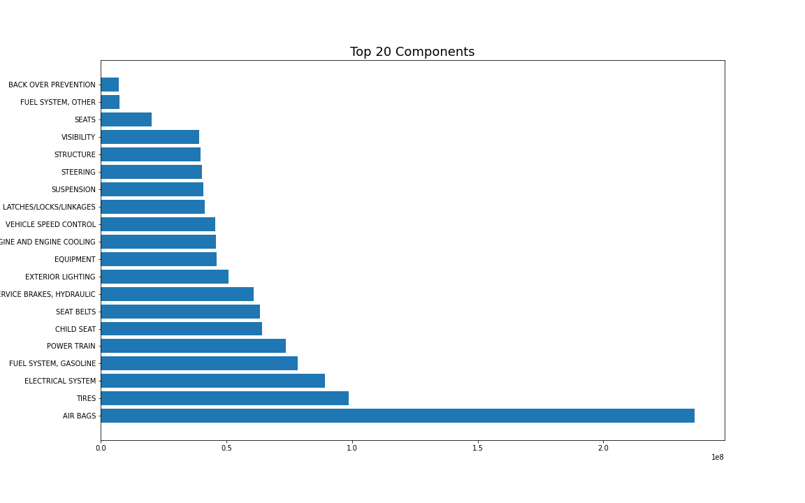
에어백 문제로 리콜된 차량이 매우 많다. 2위인 타이어하고도 2.5배 가까이 차이가 나는 것을 볼 수 있다.그런데 에어백은 리콜 횟수가 1,000회가 되지 않을 정도로 리콜 횟수는 적은 것을 보면, 평균적으로 한 번 리콜이 되었을 때 대규모로 리콜된다는 것을 유추해볼 수 있다. (또는 어떤 특별한 사건이 있었을 수도 있겠다.)
이전에 Top 3개의 회사의 리콜 횟수가 상당히 많았기 때문에 3개의 회사에 대해서 조금 더 자세히 살펴볼 것이다.
- Top 3개 회사에 대해 Top 20개 리콜 부품 살펴보기
top_3_manufacturer = top_12_manufacturer[:3]

plt.figure(figsize=(20,15))
for i, manu in enumerate(list(top_3_manufacturer.index)):
  plt.subplot(3, 1, i+1)

  df_temp = df.loc[df['Manufacturer'] == manu, :]
  plt.title(manu)

  top_20_components = df_temp['Component'].value_counts()[:20]
  top_20_components = top_20_components.sort_index()
  top_20_components.plot(kind='barh')

plt.savefig('top_20_components_of_top_3_manufacturer.png')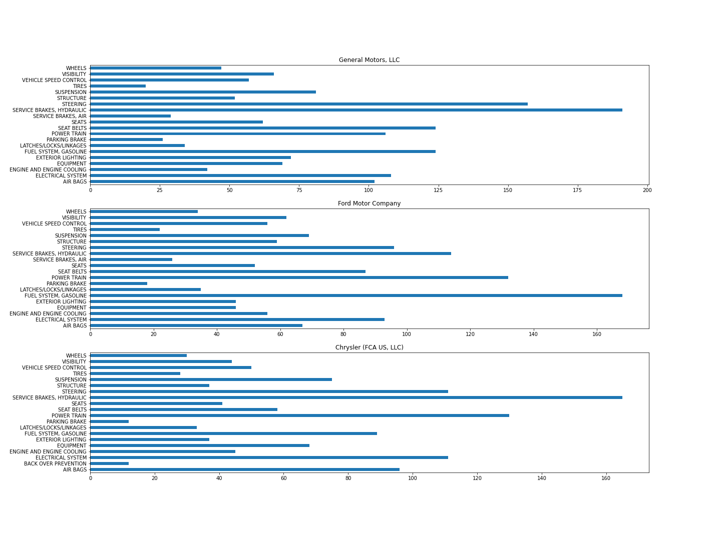
3개 회사에서 가장 리콜을 많이 한 부품이 다르다. General Motors사는 유압식 브레이크, 핸들 순이고, Ford Motor사는 연료 시스템(가솔린), 파워 트레인, Chrysler사는 유압식 브레이크, 파워 트레인 순이었다.
- 연도별 리콜 횟수 살펴보기
연도별로 리콜 횟수를 살펴보기 위해 아래 코드와 같이 연도를 분리해 주었다.
df['Report Year'] = df['Report Received Date'].str.split('/', expand=True)[2]ex) 01/06/2023 -> 2023
plt.figure(figsize=(20,8))
plt.xticks(rotation=45)
sns.countplot(x=df['Report Year'].sort_values())
plt.title('Recall Time Series', fontsize=18)

plt.savefig('Recall Time Series.png')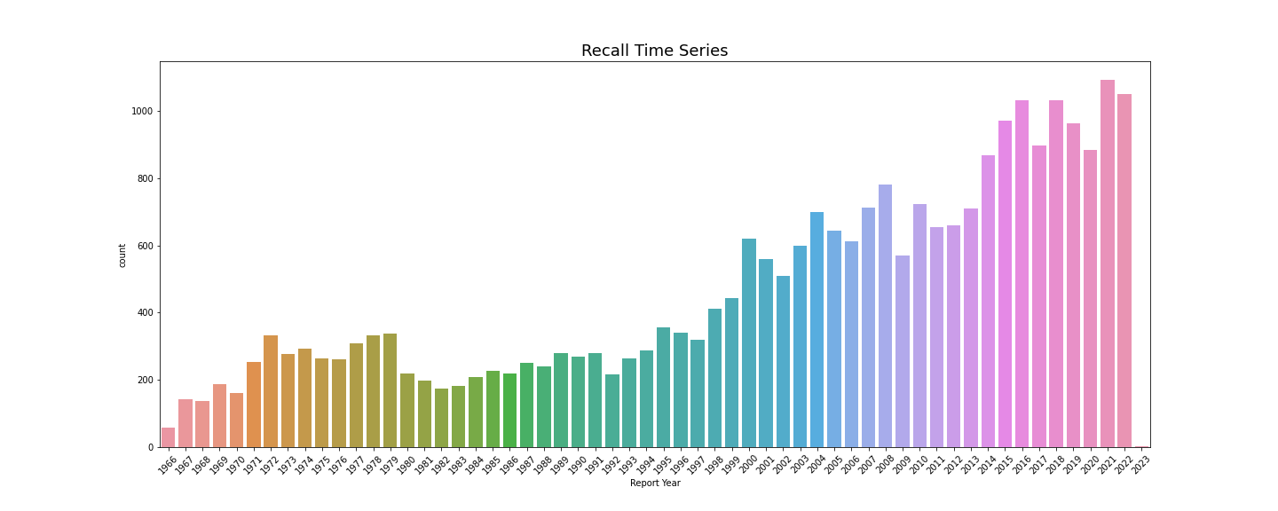
해가 지날수록 리콜 횟수가 점점 더 많아지고 있다. 수요가 많아지고, 공급 또한 많아지니 당연한 결과이지 않을까 조심스럽게 생각해본다. 자동차의 안정성을 보려면 리콜 비율을 따지는 것이 더 옳을 것 같다.
마지막으로 리콜된 차량의 평균과 합계를 Time series로 나타내보았다.
# ax: matplotlib.axes._subplots.AxesSubplot
ax = plt.figure(figsize=(20,8)).add_subplot()

ax.plot(year_mean.index, year_mean.values.reshape(-1), 'r-', label='mean')
# set xticks rotation before creating twinx()
plt.xticks(rotation=45, fontsize=12)

ax2 = ax.twinx()
ax2.plot(year_mean.index, year_sum.values.reshape(-1), 'b-', label='sum')

plt.title('Potentially Affected by Year', fontsize=18)

ax.legend(loc='upper left', fontsize=15)
ax2.legend(fontsize=15)
ax.set_ylabel('mean')
ax2.set_ylabel('sum')

plt.savefig('Potentialy_Affected_by_Year.png')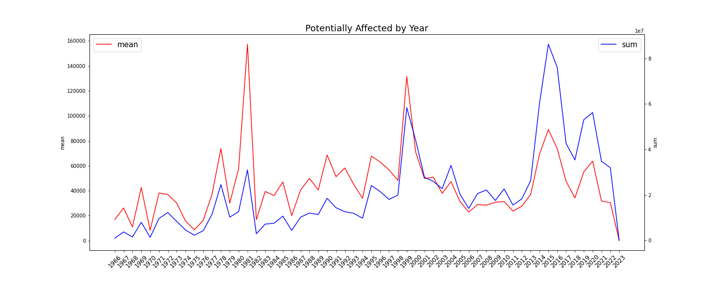
리콜되는 차량의 절대적인 수는 해가 갈수록 차량 공급이 많아짐에 따라 점점 늘어나는 모습을 볼 수 있다. 그리고 그래프의 특이한 점으로 1981년과 1999년의 리콜 차량 평균값이 매우 높은 것을 볼 수 있는데, 차량의 대규모 리콜 사건이 있었다는 것을 예상해볼 수 있을 것이다.
이번주의 데이터 시각화는 이정도로 정리를 해보았다. 이렇게 정리하는데 혼자서 처음 해보는 것이기도 하고 (물론 이전에 강의를 들으면서 연습은 몇 번 해보았지만) 아직 matplotlib, seaborn같은 시각화 라이브러리들도 익숙치 않아서 생각보다 고전했다. 짧은 내용같지만 꼬박 하루가 걸렸다... 처음 데이터를 접하다보니 어디부터 EDA를 시작해야할지 막막하기도 하다. 그래도 해보면서 느낀 것은 데이터가 다양한 그래프로 눈에 보이니까 재미있다 ㅎㅎ
매주 수요일 날 유튜브로 Data Visualization Review가 올라온다. 아래는 2023/W4에 대한 링크이다.
https://youtu.be/II6dStk7oUQ
+여담)
영상에서 보니 데이터 시각화 도구로 Tableau를 사용하고 있었다. Tableau는 데이터 분석을 위한 시각화 플랫폼인데, GUI로 간편하게 데이터 시각화를 시도해볼 수 있다. 그리고 시각화 파일을 만드는데 매우 용이해 보이더라... 다양한 차트를 마우스 드래그로 하나의 보드에 보기 좋게 위치시킬 수 있다. 나중에 기회가 되면 Tableau를 배워보아야겠다.
Github Code: https://github.com/opkwisdom/EDA_Practice/blob/master/2023%20W4_NHTSA_Automobile_Recalls.ipynb
'Data Science > EDA Practice' 카테고리의 다른 글
| [EDA Practice] Seaborn 설정 (rc) (0) | 2023.06.23 |
|---|---|
| [EDA Practice] Subplot 그리기 (0) | 2023.02.09 |
| [EDA Practice] Figure, Axes 객체 (0) | 2023.02.09 |
| [EDA Practice] EDA란? (0) | 2023.01.20 |


